Ever noticed that the colours you print sometimes look a little different to the colours on your computer screen? That’s because the spectrum of colours you see on your screen is a lot bigger than what can be printed on most printers, including the ones we use and the one you might have in your office.
Here, we’ll discuss why there are different colour spectrums for print and screens, setting up colours for your printing and some quick colour dos and don’ts!
Colour differences: RGB vs CMYK

RGB
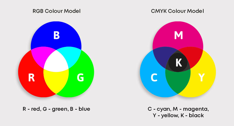
RGB (red, green, blue) colours are the ones you see on your computer monitor and on other digital screens.
For these colours, you add various amounts of red, green, or blue to a black canvas to get different colours and, when these three colours are added in equal intensity, they make white.
This means you can make lots of bright and neon colours with this colour mode that don’t really translate well to print but look fantastic on a screen!
CMYK
CMYK colours are made from cyan, magenta, yellow and black (key). They are subtractive – this means that the starting canvas is white and, as colours are added, it gets darker and darker until it’s black.
Print uses the CYMK colour mode because we start with a white background (like paper) and add colours to it until it gets darker.
Because we can’t add white, this can mean CMYK colours aren’t as bright as RGB colours, which is why the colours you print often look a little duller than they do on your screen.
Do I need to change my colours to CMYK?
When you upload your artwork to our online proofing tool, your colours will automatically be converted to CMYK, so it’s up to you whether or not you want to create artwork in this colour mode.
The benefit of setting up your colours for printing in CMYK is that you’ll be designing with exactly the colours you’ll be printing with, so you’ll know what your artwork is going to look like at the end from the get-go.
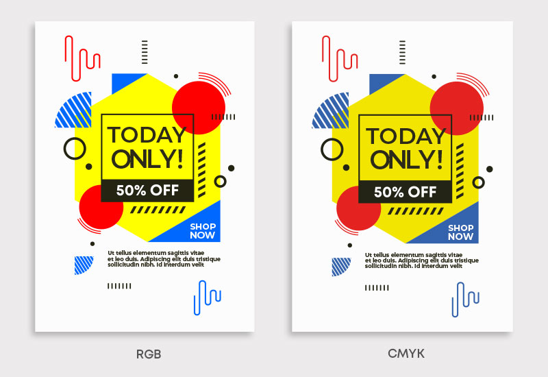
If you don’t change your colours, that’s not a problem – you’ll be able to review and approve the colours once our proofing tool has been busy converting them. Here’s an example of files that have been automatically converted from RGB to CMYK before going to print.

Why do print files need to be CMYK?
The RGB colour spectrum is huge – much larger than the CMYK spectrum. This means that some colours, like fluorescent orange and green, aren’t available within the CMYK spectrum. Commercial printing presses, like ours, print onto white paper and we add colours until the canvas is darker.
Printing in black and CMYK
Technically, if you added cyan, magenta, and yellow together in equal and large amounts, it would create black. However, due to impurities of the ink, true black is hard to recreate – that’s why printers include a black ink (K) along with the other colours.
If you want to use black in your design, we recommend using the CMYK values of (30, 30, 30, 100) as we’ve found this to be the most effective when printing.